RunUO Community
You are using an out of date browser. It may not display this or other websites correctly.
You should upgrade or use an alternative browser.
You should upgrade or use an alternative browser.
Looking for someone who likes graphic design.
- Thread starter Jeff
- Start date

")


Storm33229
Knight
Ilutzio said:
Self critisism:
To dark blue hue in uo logo.
The border edges can be cleaned up.
It's hard to tell that the bolt head is suposed to be a bolt head...
It's hard to tell that the uo logo is supposed to be a wrench.
The logo is not vector based, there fore not very sharp.
More constructive c. is welcome.
Best one by far.
-Storm
Jeff
Lord
Storm33229 said:Best one by far.
-Storm
SorryJeff said:Some issues to think about:
Cant use UO logo
Cant use Ingame Graphics


Storm33229
Knight
Setric ftw tbh.
-Storm
-Storm

S.i.r R.y.a.n
Wanderer
Sir Ryan's design 
Heres my design :/

I spent about 35 mins on it, texting aint really that great but :/ here you are.
Heres my design :/
I spent about 35 mins on it, texting aint really that great but :/ here you are.
Constructive critisism for S.i.r R.y.a.n:
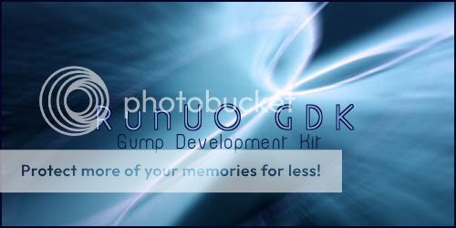
On the left side, there is to much text in different alignments, cneter, right, left, top.
The small white "person icons" in bottom right, why are they there?
I have never seen a splash in that format, i meen, long width, short height.
The top white text (to the far left) is to far left.
It's hard to tell what the programs name is, if you read normally (left to iright, and down) it seems like the program name is: Gump development kit RunUO GDK.
Positive:
Nice background.
Nice color scheme.
I like the white romb boxes, in the bottom left.
